Styles
Patterned vs. plain curtains: how to choose and mix them

Few curtain decisions feel as personal as choosing between plain and patterned fabric. Plain curtains are calm, flexible and timeless. Patterned curtains bring personality, movement and a sense of design. Both can look beautiful, and both can go wrong: plain curtains can feel flat and forgettable, while patterned curtains can overwhelm a room or clash with everything around them.
The good news is that there are simple principles that make the choice much easier. This guide explains when plain curtains work best, when patterns shine, how to choose the right type and scale of pattern, how to mix patterns confidently, and how to avoid the most common mistakes.
Plain curtains: the case for simplicity
Plain curtains are a single solid colour, with or without texture. They're the most popular choice for good reasons.
Advantages of plain curtains
- Versatile: they work with almost any wall colour, furniture and décor.
- Calm: they create a restful, uncluttered backdrop.
- Long-lasting style: solid colours rarely look dated.
- Flexible: you can change cushions, rugs and accessories without changing curtains.
- Make rooms feel larger, especially in light colours or when they match the walls.
- Easy to buy and replace: no need to match a pattern if you add another panel later.
- Show fullness beautifully: deep folds look rich and elegant in plain fabric.
When plain curtains are the best choice
- Rooms that already have patterned wallpaper, rugs, upholstery or busy artwork.
- Small rooms, where patterns can feel crowded.
- Minimal, modern or Scandinavian interiors.
- Rentals and homes you may sell, where neutral appeal matters.
- Open-plan spaces, where curtains need to tie different zones together.
- When you're unsure. Plain is the safest starting point.
How to stop plain curtains looking boring
- Choose texture: linen, slub weaves, velvet, bouclé and herringbone add depth without pattern.
- Choose a rich colour: a deep green or rust plain curtain makes a strong statement.
- Add a border or trim: a contrasting band on the leading edge or hem adds a tailored detail.
- Layer: plain curtains over a patterned or textured sheer.
- Use great hardware: a beautiful rod and finials become the focal point.
Patterned curtains: the case for personality
Patterned curtains include stripes, checks, florals, geometrics, botanicals, abstracts, ikats, damasks and more. They turn the window into a feature.
Advantages of patterned curtains
- Personality: they express your style instantly.
- Interest in plain rooms: they bring life to rooms with plain walls and furniture.
- Hide marks and creases better than plain fabrics.
- Tie colours together: a pattern can contain all the colours in a room in one place.
- Create illusions: stripes can make ceilings feel higher or windows feel wider.
When patterned curtains work best
- Rooms with plain walls and simple furniture.
- Large rooms and large windows, where patterns have space to breathe.
- Traditional, cottage, eclectic, bohemian and maximalist interiors.
- Children's rooms, kitchens and dining rooms, where a bit of playfulness suits the space.
- Rooms that need a focal point.
Types of curtain patterns
Stripes
Clean, classic and versatile. Thin stripes feel crisp and tailored; wide stripes feel bold and modern. Stripe direction matters too, as we'll see below.
Checks and plaids
Gingham, buffalo check, tartan and windowpane checks feel cosy, casual and slightly traditional. They suit kitchens, cottages, farmhouse and children's rooms.
Florals and botanicals
From delicate sprigs to large, painterly blooms and leafy tropical prints. Small florals feel soft and traditional; large botanicals feel fresh and dramatic.
Geometrics
Diamonds, trellis, circles, chevrons and abstract shapes feel modern and structured. They suit contemporary, mid-century and eclectic rooms.
Damask and jacquard
Woven patterns, often traditional and ornate, with a subtle tone-on-tone effect. Elegant and formal, especially in dining rooms and living rooms.
Ikat and global prints
Blurred-edge woven or printed patterns with origins in many cultures. Warm, artistic and relaxed.
Abstract and painterly
Brushstrokes, watercolour washes and artistic prints. Modern and expressive.
Subtle textures and tone-on-tone
Small woven textures, slubs and patterns in one colour sit between plain and patterned. They add interest quietly, which makes them a great compromise.
Pattern scale: the most important rule
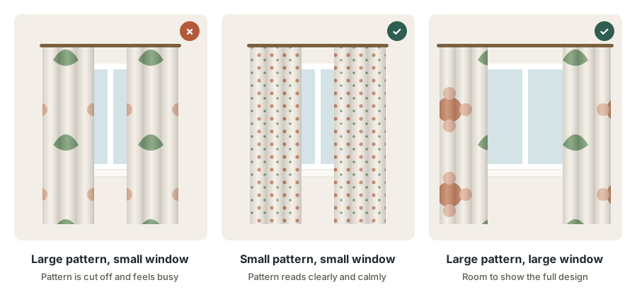
Scale means the size of the motifs and the distance between them. It has a bigger effect than colour or style:
- Large patterns suit large windows and large rooms. On a big window, a large pattern can be seen in full and becomes a confident feature.
- Small patterns suit small windows and small rooms. On a small window, a large pattern gets cut off, so you only see fragments, which can feel busy.
- Small patterns read as texture from a distance. In a large room, a very small pattern may look almost plain from across the room.
- Folds hide pattern. Deep fullness breaks up large designs, so a large pattern usually needs moderate fullness to show well.
Before buying, look at the pattern from across the room, the distance you'll normally see it from, not just up close.
Stripes: vertical or horizontal?
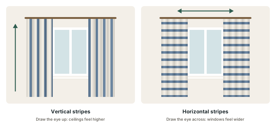
- Vertical stripes draw the eye upward, making ceilings feel higher. Ideal for rooms with low ceilings.
- Horizontal stripes draw the eye across, making narrow windows and rooms feel wider. They suit wide, low windows and casual styles.
- Thin, closely spaced stripes feel refined; wide, bold stripes feel energetic.
- Make sure stripes line up where panels meet, and that horizontal stripes are level across all panels.
How to mix patterns confidently
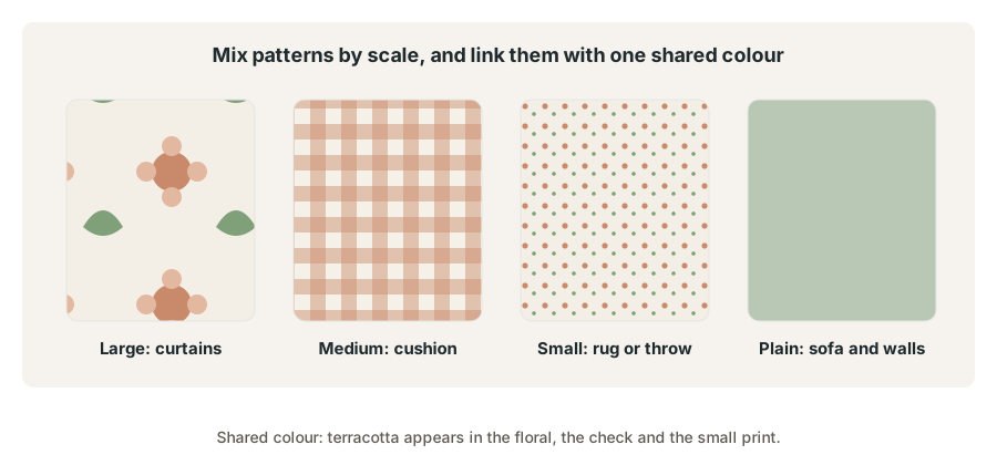
Mixing patterns can look wonderful and lived-in, as long as you follow a few simple rules:
- Vary the scale. Combine one large pattern, one medium pattern and one small pattern. Patterns of the same size compete with each other.
- Share a colour. Make sure at least one colour appears in every pattern. This ties them together.
- Mix pattern types. A floral, a stripe and a small geometric usually sit together better than three florals.
- Leave plain areas. Walls, a sofa or a rug in a solid colour give the eye somewhere to rest.
- Repeat each pattern or colour at least twice in the room so nothing looks random.
- Limit the number of patterns: three is a comfortable maximum for most rooms.
Patterned curtains with a patterned rug
Choose patterns of different scales and types, linked by colour. A large floral curtain with a small geometric rug works; a large floral curtain with a large floral rug usually feels too busy.
Patterned curtains with wallpaper
This is the boldest combination. Either use the same pattern on both for a fully immersive look, or pair patterned wallpaper with plain or very subtly textured curtains in a colour from the wallpaper. Two different strong patterns on walls and curtains usually compete.
Patterned curtains with patterned upholstery
Choose curtains in a different scale from the sofa or chairs, sharing at least one colour. If the sofa has a strong pattern, plain curtains often look best.
Choosing pattern colours
- Start with the room's main colours and look for patterns that include them.
- Choose the background colour carefully. A pattern's background covers most of the fabric, so it has the biggest effect. A white or cream background feels light; a dark background feels dramatic.
- Check the number of colours. Two- or three-colour patterns are easier to coordinate than multicoloured ones.
- Pull accent colours from the pattern for cushions, throws and accessories.
Our guide on how to choose curtain colours explains how to balance colours across a room.
Practical considerations with patterns
Pattern repeat and matching
The pattern repeat is the distance before the design starts again. When panels hang side by side, the pattern should line up horizontally across them, so the window looks like one continuous design. Ready-made patterned curtains are usually cut consistently, but check this when buying several panels. For made-to-measure curtains or home sewing, allow extra fabric for pattern matching: roughly one extra repeat per width of fabric.
Where the pattern starts
On made-to-measure curtains, a full motif usually sits at the top or just below the heading, so the pattern looks deliberate. On sewn curtains, plan the cut so all panels start at the same point in the pattern.
Fullness
Patterned curtains generally look best with moderate fullness, about 1.5–2 times the rod width, so the pattern isn't lost in deep folds. Plain curtains can take more fullness. See our guide to curtain fullness.
Lining
Light shining through an unlined patterned curtain can make the pattern look washed out or show the reverse side. A lining keeps the pattern clear and protects it from fading.
Printed vs. woven patterns
Printed patterns sit on the surface of the fabric and can fade faster in strong sun. Woven patterns, like jacquards and damasks, are part of the fabric structure and usually wear and fade more evenly.
Matching patterns to your interior style
A pattern that looks perfect in one home can look out of place in another. These pairings are a helpful starting point:
- Modern and minimal: plain curtains in neutral or muted colours, or bold geometric and abstract patterns used sparingly. Clean lines and plenty of space around them.
- Scandinavian: plain linen in white, grey or soft natural tones; simple stripes or small graphic prints in black and white.
- Traditional and classic: damask, toile, florals, stripes and plaids in rich or soft colours, often lined and full.
- Farmhouse and cottage: gingham, ticking stripes, buffalo checks and small country florals in cotton or linen.
- Mid-century modern: retro geometrics, starbursts and simple abstract shapes in mustard, teal, orange and olive.
- Bohemian and eclectic: ikat, block prints, global patterns and mixed textures. Pattern mixing is part of the style.
- Coastal: plain white or sand-coloured curtains, blue-and-white stripes and soft natural textures.
- Industrial: plain heavy fabrics in charcoal, rust or natural tones, or simple bold stripes.
If you're not sure what your style is, look at the furniture you already own and the photos of rooms you like. The patterns that appear again and again in those rooms tell you a lot about what will feel right in yours.
How patterns interact with light
Curtains are seen in two very different conditions: open and lit from the room during the evening, and closed with daylight behind them. Patterns behave differently in each:
- Backlighting: on unlined or light fabrics, daylight shining through can blur the pattern and show the printed design faintly from outside. Woven patterns may show their reverse side as a darker or lighter shadow.
- Sheer patterns come alive in daylight. Embroidered, burnout or printed sheers cast soft patterned light into the room, a lovely effect in living rooms and bedrooms.
- Evening light: warm lamps can make colours look richer, and cool overhead light can flatten them. Check fabric samples at night as well as during the day.
- Fading: sun-facing windows fade printed patterns faster, especially reds and blues. A lining or a sheer behind the curtains helps protect them.
Patterned or plain: room by room
Living room
Plain or subtly textured curtains suit most living rooms, especially with patterned rugs or cushions. Choose patterned curtains when the room is plain and you want the window to be a feature. Our living room curtain ideas include more examples.
Bedroom
Plain curtains in calm colours are restful. Soft, small-scale patterns or gentle botanicals work well too. Avoid busy, high-contrast patterns if you find them stimulating. See our guide to the best curtains for bedrooms.
Kitchen
Kitchens are a great place for cheerful patterns: checks, stripes, small florals and fruit or herb prints suit café curtains and valances.
Dining room
Formal patterns like damask, large florals and stripes look elegant here, especially in rich colours.
Children's room
Playful patterns are fun, but consider designs the child won't outgrow quickly, such as stars, stripes, checks or simple animals, rather than specific characters.
Home office
Plain or subtle patterns are less distracting. Avoid bold patterns directly in your line of sight.
Bathroom
Small patterns or stripes on café curtains add charm without overwhelming a small space.
Patterned and plain together
You don't have to choose just one. Some of the most successful windows combine both:
- Plain curtains with a patterned valance or pelmet across the top.
- Plain curtains with a patterned border on the leading edge or hem.
- Patterned curtains with plain sheers behind them, which keep the window light.
- Plain curtains with patterned tiebacks made from the same fabric as cushions.
- Patterned roman shades with plain side panels, so the pattern sits in the window and the plain fabric frames it.
How to test a pattern before you buy
Patterns are harder to judge from a small swatch or a website photo than plain fabrics. A few simple tests save expensive mistakes:
- Order a large sample. Many fabric shops sell samples or half-metre cuts. A larger piece shows the full repeat, which a small swatch often can't.
- Pin it up at the window. Hang the sample where the curtains will go, gathered into loose folds, so you can see how the pattern looks when it isn't flat.
- Step back. Look from the doorway and from your usual seat. Small patterns may disappear into texture; large patterns may feel stronger than expected.
- Check it in different light: morning, afternoon and evening, with daylight behind it and with lamps on.
- Put it next to your other fabrics. Hold the sample against the sofa, rug, cushions and wall colour to check the colours really work together.
- Live with it for a few days. If you still like it after a week, it's probably the right choice. If you're already tired of it, choose something calmer.
Take a photo of the sample in place, too. Photos make it easier to compare several options side by side, and they often reveal clashes that are easy to overlook in person.
Buying tips and budget
- Ready-made patterned curtains are affordable but come in fixed sizes. Check that the pattern lines up across both panels and that the pattern looks even along the hem.
- Made-to-measure curtains cost more but place the pattern deliberately and match it across all widths. They're worth it for large, important windows.
- Pattern adds fabric cost when sewing, because of the extra needed for matching. Budget roughly 10–20% more fabric than for a plain design, depending on the repeat size.
- Plain curtains are easier to add to later. If you might extend a curtain or replace a damaged panel, a plain or simple design is easier to match than a discontinued pattern.
- Get more pattern for less: a patterned valance, tieback, border or cushion set gives you the effect of pattern while keeping the main curtains plain and versatile.
Common mistakes
- A large pattern on a small window, so the design is cut off and looks busy.
- Too many patterns of the same scale, all competing for attention.
- No shared colour between patterned curtains and the rest of the room.
- Mismatched pattern alignment between panels.
- Too much fullness on a large pattern, hiding the design.
- Unlined patterned curtains on bright windows, washing out the pattern.
- Plain curtains with no texture in a room with nothing else of interest, which can look flat.
A quick decision checklist
If you're still undecided, answer these questions honestly:
- Does the room already have a patterned rug, wallpaper or sofa? If yes, lean towards plain curtains.
- Is the room plain and lacking a focal point? If yes, a patterned curtain could be exactly what it needs.
- Is the window small, or the room compact? Choose plain or a small-scale pattern.
- Do you change your décor often? Plain curtains give you more freedom.
- Is there a fabric you keep coming back to? If you truly love it, it will probably make you happy for years.
Frequently asked questions
Are plain or patterned curtains better?
Neither is better overall. Plain curtains are more versatile and calming; patterned curtains add personality and a focal point. Choose plain if your room already has pattern, and patterned if the room is plain.
Do patterned curtains make a room look smaller?
Large, busy or dark patterns can make a small room feel smaller. Small, light patterns or vertical stripes have much less effect, and vertical stripes can even make a room feel taller.
Can I mix patterned curtains with a patterned rug?
Yes, if the patterns differ in scale and type and share at least one colour.
Are patterned curtains out of style?
No. Patterns go in and out of fashion, but stripes, checks, botanicals and geometric designs remain popular. Choose a pattern you genuinely love rather than one that's only on trend.
How do I choose a pattern if I'm unsure?
Start with subtle options: tone-on-tone weaves, thin stripes or small geometric patterns. They add interest without the risk of overwhelming the room.
Should patterned curtains match the cushions?
They don't need to match, but they should relate. Use cushions in a plain colour taken from the curtain pattern, or in a smaller coordinating pattern.
Do patterned curtains need to be lined?
Lining is strongly recommended. It keeps the pattern crisp, prevents light from washing out the colours, hides the reverse side from outside and slows fading.
Should all the curtains in my home match?
No. In open-plan spaces or on windows visible together, matching or coordinating curtains create a calm, unified look. In separate rooms, you can choose freely. Many people use plain curtains in shared areas and save patterns for bedrooms, kitchens or children's rooms.
Can I use patterned curtains in a small room?
Yes. Choose a small-scale or light-coloured pattern, or vertical stripes, and keep the rest of the room fairly plain. Hanging the curtains high and wide, as explained in our guide on how high to hang curtain rods, also helps the room feel larger.
The bottom line
Choose plain curtains when the room already has pattern, when you want calm and flexibility, or when you're unsure. Choose patterned curtains when the room is plain and you want personality or a focal point. Match the pattern scale to the window size, use stripes to add height or width, mix patterns by varying their scale and linking them with a shared colour, and give patterns moderate fullness so they can be seen. Follow these principles, and both plain and patterned curtains will look deliberate and beautiful.
Keep reading
 Styles
Oak wooden blinds: shades, slat sizes, real oak vs oak-effect, and care
Oak wooden blinds bring light, natural warmth to any room. Compare oak shades, real wood and oak-effect options, slat sizes and tapes, and learn how to style and care for them.
 Styles
Fitted horizontal blinds: a complete guide to made-to-measure blinds that fit perfectly
Fitted horizontal blinds are made to the exact size of your window, so they look neat and control light properly. Compare types, fitting methods, measuring and care.
 Styles
Blackout roman shades: how to choose, measure and fit them for a truly dark room
Blackout roman shades combine soft fabric folds with real darkness. Learn the styles, linings, mounts, measuring, cord safety and tricks that stop light leaking around the edges.