Styles
How to choose curtain colours for every room

Curtains cover a large area of wall, so their colour has a big effect on how a room feels. The right colour can make a small room feel larger, a dark room feel brighter, a cold room feel cosier, or a plain room feel finished. The wrong colour can clash with the walls, overwhelm the furniture, or make a room feel smaller and heavier than it is.
Many people find choosing curtain colours stressful, because there are so many options and the decision feels permanent. The good news is that a few simple principles make it much easier. This guide explains how to choose a colour that works with your walls, floors and furniture, how daylight changes the way colours look, when to choose neutrals and when to be bold, how to use patterns, and which colours suit each room.
Start with the room, not the curtain
Before looking at curtain samples, look at the room itself. Note down:
- The wall colour, including whether it's warm (yellowish, pinkish, beige) or cool (bluish, greyish, green-grey).
- The floor: wood tone, tiles or carpet colour.
- The large furniture: sofa, bed, rug and cabinets.
- The accent colours already in the room: cushions, artwork, plants, lamps.
- The light: which way the window faces, and whether the room feels bright or dim.
- The mood you want: calm, cosy, fresh, dramatic, playful or elegant.
Curtains rarely look good when they're chosen in isolation. When they're chosen to support the colours already in the room, they almost always do.
Three ways to pair curtains with your walls
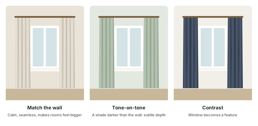
1. Match the wall
Choose curtains in the same colour as the wall, or very close to it. The curtains blend into the background, which makes the room feel calm, seamless and larger. This is a great choice for small rooms, rooms with busy furniture or patterned rugs, and anyone who wants a quiet, restful look.
White walls with white or ivory curtains, or warm beige walls with oatmeal linen curtains, are classic examples.
2. Tone-on-tone
Choose curtains in a slightly darker or lighter shade of the wall colour. For example, pale sage walls with deeper sage curtains, or light grey walls with charcoal curtains. This adds depth and sophistication while keeping the room harmonious. It's one of the most foolproof approaches.
3. Contrast
Choose curtains in a colour clearly different from the wall, so the window becomes a feature. Navy curtains against white walls, terracotta curtains against cream walls, or emerald curtains against soft grey walls all create a strong focal point. Contrast works best when the curtain colour is repeated elsewhere in the room, such as in cushions, artwork or a rug, so it feels intentional.
The 60-30-10 guide
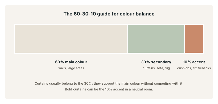
Interior designers often use a simple guide to balance colour in a room:
- 60% main colour: usually the walls and other large surfaces.
- 30% secondary colour: curtains, the sofa, a large rug or bedding.
- 10% accent colour: cushions, artwork, vases, lamps and small details.
In most rooms, curtains belong to the 30%: they support the main colour without competing with it. In a very neutral room, though, bold curtains can act as the 10% accent, bringing life and personality to a calm background. This isn't a strict rule, but it's a helpful way to check that a room feels balanced rather than chaotic or flat.
How daylight changes curtain colours
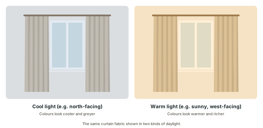
Curtains hang right at the window, so they're affected by daylight more than almost anything else in the room. The same fabric can look completely different depending on the light:
- Cool, indirect light (common in rooms that don't get direct sun) makes colours look cooler, greyer and slightly darker. Warm colours like cream, sand, terracotta and soft yellow help balance it.
- Warm, direct sunlight makes colours look warmer and more golden. Cool colours like soft blue, grey and green can feel refreshing, while very warm colours may look orange or yellow.
- Backlighting: when the sun shines through unlined curtains, their colour glows and changes. A pale fabric may look warmer; a dark fabric may show its weave. Lined curtains change much less.
- Artificial light at night also changes colours. Warm bulbs make colours look warmer; cool bulbs make them look cooler.
Which direction "cool" and "warm" light comes from depends on where you live. In the northern hemisphere, north-facing rooms usually get cooler light and south- and west-facing rooms warmer light; in the southern hemisphere it's reversed. Close to the equator, east- and west-facing windows make the biggest difference, with morning and afternoon sun.
The practical lesson: always look at fabric samples at your own window, at different times of day, before deciding.
Neutral curtains: when and how to use them
Neutral colours include white, ivory, cream, beige, oatmeal, taupe, greige, grey and charcoal. They're the most popular curtain colours for good reasons:
- They suit almost any wall, floor and furniture.
- They don't date quickly.
- They let you change cushions and accessories without changing curtains.
- Light neutrals make rooms feel bright and spacious.
Making neutrals interesting
Neutral doesn't have to mean boring. Add interest through:
- Texture: linen, slub weaves, velvet, bouclé and jacquard all bring depth to plain colours.
- Layering: combine an ivory sheer with an oatmeal curtain for soft dimension.
- Hardware: a black, brass or wooden rod adds definition.
- Trims: a contrasting border or tape along the leading edge adds a tailored detail.
Warm vs. cool neutrals
Not all neutrals are the same. Warm neutrals (cream, beige, sand, oatmeal, camel) have yellow, red or pink undertones and feel cosy. Cool neutrals (white, grey, stone, charcoal) have blue or green undertones and feel crisp and modern. Match the undertone of your curtains to the undertone of your walls and floors for a harmonious result. Mixing a cool grey curtain with a warm beige wall often looks "off" without people knowing why.
Bold and coloured curtains
Coloured curtains bring personality and can transform a room instantly. Some ideas:
- Navy and deep blue: elegant, calm and timeless. Works with white, grey, wood and brass.
- Green (sage to emerald): natural and restful in soft shades, rich and dramatic in deep shades. Lovely with plants, wood and rattan.
- Terracotta, rust and clay: warm, earthy and welcoming. Pairs well with cream, olive and natural textures.
- Mustard and ochre: cheerful and warm, especially with grey or navy.
- Blush and dusty pink: soft and warm, surprisingly versatile with grey, green and wood.
- Plum and burgundy: rich and cosy, ideal for bedrooms, dining rooms and media rooms.
How to use bold colours successfully
- Repeat the colour at least twice elsewhere in the room, in cushions, a rug, artwork or a vase.
- Keep other large surfaces calm, so the curtains have room to shine.
- Choose muted or dusty versions of bright colours if you're nervous. They're easier to live with.
- Consider the light: deep colours look darker in dim rooms and can fade in strong sun unless lined.
Dark vs. light curtains
| Light curtains | Dark curtains | |
|---|---|---|
| Room size | Make rooms feel larger | Make rooms feel cosier and more intimate |
| Brightness | Reflect light, keep rooms bright | Absorb light, make rooms feel darker |
| Heat | Reflect more sunlight | Absorb more heat on the room side |
| Fading | Fade less visibly | Show fading more in strong sun |
| Marks and dust | Show stains more | Show dust and lint more |
| Best for | Small rooms, dim rooms, calm spaces | Bedrooms, media rooms, large rooms, dramatic looks |
For blackout curtains, the colour you see doesn't change how much light the fabric blocks; a proper blackout layer works in any colour. Our blackout curtains guide explains more.
Choosing curtains to match floors and furniture
Wood floors
Warm wood floors pair beautifully with warm neutrals, greens, blues and terracotta. Avoid curtains that are exactly the same tone as the wood, which can look flat; choose something lighter, darker or in a contrasting colour.
Tiled or concrete floors
Cool grey or white floors suit crisp whites, greys and blues. Add warmth with linen textures or earthy tones if the room feels cold.
The sofa or bed
Curtains don't need to match the sofa or bedding. They should relate to them. Pick a colour from a cushion, a stripe in the bedding or a shade in the rug. A grey sofa with blush cushions might suit blush or soft grey curtains; a navy bed with ochre accents might suit ochre or navy curtains.
The rug
Rugs often contain several colours, making them a perfect source for curtain colours. Choose one of the quieter shades in the rug for a calm look, or one of the stronger shades for more impact.
Patterned curtains
Patterns add movement and personality. A few guidelines help them look their best:
- Scale: large patterns suit large windows and rooms; small patterns suit small windows and busy rooms. Large patterns on small windows can look cramped.
- Fullness: deep folds hide much of a large pattern, so use moderate fullness to show it off.
- Balance: if curtains are patterned, keep walls and large furniture plain, or vice versa.
- Colour: pick a pattern that includes colours already in the room.
- Stripes: vertical stripes make ceilings feel higher; horizontal stripes make windows feel wider.
- Subtle patterns: small weaves, textures and tone-on-tone jacquards add interest without overwhelming.
How different colours tend to feel
People react to colours differently, and culture and personal memories play a part. Still, many colours have widely shared associations that are useful when choosing curtains:
- White and ivory: fresh, clean, open and calm.
- Beige, sand and oatmeal: warm, relaxed and comforting.
- Grey: calm, balanced and modern; can feel cold if the undertone is very blue.
- Blue: calm, cool and restful; deep blues feel elegant and serious.
- Green: natural, balanced and refreshing; connects rooms to gardens and plants.
- Yellow and mustard: cheerful, warm and energising; best in muted shades for large areas.
- Terracotta, rust and orange: warm, earthy and welcoming.
- Pink and blush: soft, gentle and warm.
- Red and burgundy: rich, dramatic and cosy; deep reds suit dining rooms and libraries.
- Purple and plum: luxurious, creative and dramatic.
- Black and charcoal: bold, graphic and sophisticated.
Use these associations as a starting point, then trust your own reaction. If a colour makes you feel good when you see it in your room, it's probably the right one.
Coordinating curtains across an open-plan space
In open-plan homes, where the living, dining and kitchen areas share one space, curtains in different zones are seen together. A few tips keep them harmonious:
- Use the same curtain, or the same colour family, on all windows in the open space.
- Keep rod heights and finishes consistent across all windows.
- Vary function, not colour: for example, the same fabric as full curtains in the living area and as a roman shade over the kitchen sink.
- Use one accent colour that appears in several zones, such as cushions in the living area and chair seats at the dining table.
Curtain colours for rentals and homes you might sell
If you rent, or expect to sell your home, curtains need to work with walls and floors you may not be able to change, and appeal to many people:
- Neutrals are the safest choice: white, ivory, oatmeal, stone and soft grey work with almost any wall colour.
- Bring personality through accessories, which are cheaper to change and easy to take with you.
- Choose versatile curtains in standard sizes, so they'll fit future windows too.
- For selling, light, simple curtains hung high and wide make rooms look larger and brighter in photos.
Changing curtain colours with the seasons
Some people enjoy swapping curtains seasonally for a fresh feel:
- Warmer months: light, airy colours such as white, sand, pale blue and soft green, often in linen or sheers.
- Cooler months: richer, deeper colours such as rust, ochre, navy and burgundy, often in velvet or heavier weaves.
- Easy swaps: keep neutral sheers on the inner rod all year, and change only the outer curtains.
Using the colour wheel
A simple colour wheel can help when you want curtains that feel deliberate rather than random:
- Analogous colours sit next to each other on the wheel, such as blue, blue-green and green. Curtains in a neighbouring colour to the walls or sofa create a calm, harmonious room.
- Complementary colours sit opposite each other, such as blue and orange, or green and red. A complementary curtain colour creates energy and contrast. Soften it by choosing muted versions, such as navy with rust, or sage with dusty pink.
- Monochromatic schemes use several shades of one colour, such as pale grey walls, mid-grey sofa and charcoal curtains. They're elegant and very easy to get right.
You don't need to follow these rules strictly, but they explain why some combinations feel right and others don't.
Best curtain colours for each room
Living room
Warm neutrals, soft greens, blues and earthy tones work in most living rooms. Choose a colour that relates to the sofa and rug. For a statement, use a deep colour like navy, forest green or rust, repeated in cushions and artwork. Read our living room curtain ideas for more.
Bedroom
Calm, restful colours: soft neutrals, sage, dusty blue, blush, or deep navy and charcoal for a cocooning feel. Avoid very bright, energetic colours if you find them stimulating. Our guide to the best curtains for bedrooms includes four calming palettes.
Kitchen
Fresh, light colours: white, cream, soft yellow, pale green or blue. Small checks, stripes and simple prints suit kitchen café curtains. Choose washable fabrics.
Bathroom
White, soft blues and greens, or warm neutrals. Light colours make small bathrooms feel larger and cleaner.
Dining room
Dining rooms can handle richer, deeper colours: burgundy, navy, emerald, gold or warm taupe, especially in velvet or jacquard.
Children's room
Playful colours are fine, but consider soft or muted versions that the child won't outgrow quickly. Blackout linings help with naps.
Home office
Calm, focused colours like soft grey, sage, blue or warm white. Avoid strong patterns near screens, which can be distracting.
Small rooms
Light colours or curtains that match the walls make small rooms feel larger. Floor-length curtains hung high add height.
Dark rooms
Light, warm colours reflect light and make dim rooms feel brighter. Sheers or light-filtering fabrics let in as much daylight as possible.
Colours in sunny climates
In very sunny places, curtains fade faster, especially in deep, saturated colours and natural fibres. To keep colours looking fresh:
- Line your curtains. The lining takes most of the sun.
- Choose fade-resistant fabrics such as polyester, acrylic or solution-dyed fabrics for the sunniest windows.
- Choose lighter colours for windows that get hours of direct sun; fading is less visible.
- Rotate panels occasionally so they fade evenly.
- Close sheers or shades during the strongest sun to protect the main curtains.
How to test curtain colours before you buy
- Order swatches of your top two or three choices.
- Pin them at the window, not on a table, so you see them in real light.
- Look at them morning, afternoon and evening, and with your lamps on at night.
- Hold them next to the wall, sofa and floor to check how they relate.
- Step back to the far side of the room. Curtains are seen from a distance, and colours often look softer from afar.
- Live with them for a day or two. First impressions can change.
Common curtain colour mistakes
- Choosing from a screen. Colours on screens are rarely accurate. Order swatches.
- Mixing warm and cool undertones without meaning to, so colours look slightly off together.
- Matching everything exactly. A room with identical curtains, cushions and bedding can look flat. Relate colours instead.
- A bold colour used only once. Repeat it elsewhere so it looks intentional.
- Dark, unlined curtains in strong sun. They'll fade quickly.
- Large patterns on small windows. The pattern gets cut off and looks busy.
- Ignoring the view. If the window looks onto greenery, green or neutral curtains connect the room to the outside.
Frequently asked questions
Should curtains be lighter or darker than the walls?
Either can work. Curtains slightly darker than the walls (tone-on-tone) are a safe, elegant choice. Lighter curtains keep a room airy. Clearly contrasting curtains make the window a feature.
What colour curtains go with white walls?
Almost anything. White or ivory for a fresh, seamless look; oatmeal or grey for soft warmth; navy, green or terracotta for contrast.
What colour curtains go with grey walls?
White, charcoal, navy, blush, mustard and soft green all pair well with grey. Match the undertone: warm greys suit warm colours, cool greys suit cool colours.
What colour curtains make a room look bigger?
Light colours, or curtains that match the wall colour, hung high and wide in floor length.
Should curtains match the sofa?
They don't need to match exactly. Choose a colour that relates to the sofa, cushions or rug.
Are neutral curtains boring?
Not when you add texture, layers and good hardware. Neutrals are versatile and timeless, and they let you change other colours in the room easily.
What colour curtains go with a brown or wood-toned floor?
Cream, oatmeal, sage, olive, navy, dusty blue and terracotta all complement warm wood. Avoid curtains in exactly the same tone as the wood.
Can I mix patterned curtains with a patterned rug?
Yes, if the patterns differ in scale (one large, one small) and share at least one colour. Keep the walls and sofa plain to balance them.
The bottom line
Choose curtain colours by looking at the whole room first. Decide whether you want the curtains to blend in (match), add depth (tone-on-tone) or stand out (contrast). Balance colours with the 60-30-10 guide, match warm or cool undertones, and always test swatches in your own window light. Neutrals are safe and versatile; bold colours bring personality when they're repeated elsewhere. Get these basics right, and your curtains will make the whole room feel complete.
Keep reading
 Styles
Oak wooden blinds: shades, slat sizes, real oak vs oak-effect, and care
Oak wooden blinds bring light, natural warmth to any room. Compare oak shades, real wood and oak-effect options, slat sizes and tapes, and learn how to style and care for them.
 Styles
Fitted horizontal blinds: a complete guide to made-to-measure blinds that fit perfectly
Fitted horizontal blinds are made to the exact size of your window, so they look neat and control light properly. Compare types, fitting methods, measuring and care.
 Styles
Blackout roman shades: how to choose, measure and fit them for a truly dark room
Blackout roman shades combine soft fabric folds with real darkness. Learn the styles, linings, mounts, measuring, cord safety and tricks that stop light leaking around the edges.